

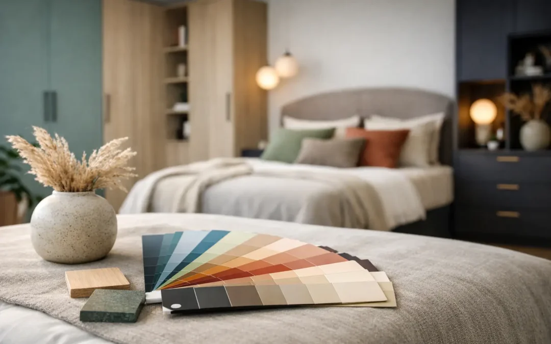
A fitted bedroom lives or dies by its finish. Get the colour right and the room feels larger, calmer and properly put together. Get it wrong and even beautifully made cabinetry can feel heavy or dated. That is why fitted bedroom colour trends 2026 matter more than passing fashion – they shape how bespoke furniture sits within the room, how light moves across the space and how practical the whole scheme feels day to day.
For 2026, the shift is clear. Homeowners are moving away from flat, cold neutrals and towards colours with more warmth, depth and character. The strongest schemes are not loud for the sake of it. They are measured, liveable and designed to work hard in real homes, especially where fitted wardrobes, dressing areas and built-in storage need to look elegant without dominating the room.
Fitted bedroom colour trends 2026 are warmer and more grounded
The biggest change is temperature. Grey is not disappearing entirely, but the sharper blue-based versions that dominated for years are giving way to warmer shades with brown, taupe and stone undertones. In fitted bedrooms, that matters because built-in furniture covers a lot of visual space. A colour that feels slightly cold on a paint chart can feel much colder when applied across full-height wardrobes.
Soft mushroom, putty, cashmere and warm greige are all strong choices for 2026. They work particularly well when you want a room to feel calm and tailored, but not plain. They also pair neatly with natural oak effects, bronze handles and textured fabrics, which helps create a bedroom that feels finished rather than one-dimensional.
This is where bespoke design has a real advantage. On freestanding furniture, colour can look disconnected. On fitted furniture, the finish can be carried across wardrobes, bedside units, dressing tables and even wall panelling, so the whole room feels considered from the start.
The colours set to lead fitted bedrooms this year
Warm neutrals that do not wash out the room
If there is one safe bet for 2026, it is the move towards neutrals with substance. Think almond, oat, clay, parchment and soft taupe rather than brilliant white or icy grey. These shades suit both classic shaker doors and cleaner slab designs, depending on the style of the home.
They are also forgiving. Bedrooms need to feel restful, and softer neutrals tend to work in changing daylight, under bedside lighting and through different seasons. In homes across the South of England, where room orientation can dramatically affect how colour reads, that flexibility matters.
The trade-off is that very pale warm shades need contrast somewhere. Without it, a fitted room can feel too uniform. That contrast might come through handles, a darker top panel, timber detailing or a stronger wall colour behind the bed.
Earthy greens still have real staying power
Green remains one of the strongest fitted bedroom colour trends 2026, but the tone is changing. The fresher sage shades that became popular in recent years are now being joined by muddier olive, eucalyptus, moss and muted lichen tones.
These colours bring enough personality to make fitted furniture feel bespoke, yet they are still calm enough for a bedroom. They also work well with both painted finishes and more tactile materials. Pair them with linen, brushed brass or walnut tones and the result feels grown-up and settled.
Darker greens can be particularly effective on larger fitted wardrobes, especially in period homes or master bedrooms with decent ceiling height. In smaller rooms, though, it depends on the light. If the space is north-facing or naturally dim, a deep green may need balancing with lighter walls, mirrored panels or a paler interior scheme to avoid making the room feel enclosed.
Dusty blues become more refined
Blue is still in the picture, but it is less coastal and less pastel than before. For 2026, think mineral blue, smoky denim, muted slate and soft petrol rather than bright duck egg or navy everywhere.
These more complex blues work well in fitted bedrooms because they add depth without shouting. They suit contemporary homes, but they can also look excellent in traditional properties when paired with framed doors and warmer metallic details.
Blue is often a good choice for clients who want colour but are wary of going too earthy. It sits comfortably between classic and current. The key is to avoid overly crisp whites alongside it, which can make the scheme feel colder than intended.
Richer tones are moving into feature furniture
A more confident use of colour is starting to show up in fitted bedroom design, especially on statement dressing areas, wardrobes around chimney breasts or a central run of cabinetry that anchors the room. Deep plum-brown, cocoa, muted aubergine and dark ink tones are gaining ground.
This does not mean every bedroom is turning dark. More often, these richer shades are being used selectively to create contrast within a broader scheme. A bank of wardrobes in a deep tone can look striking when balanced with softer walls, lighter flooring and good lighting.
Used badly, dark colours can swallow space. Used well, they make bespoke furniture look architectural and expensive. The difference is nearly always in the planning – proportions, room size, natural light and the detailing around the cabinetry all need to be considered properly.
What is falling away in 2026
Some trends are simply losing momentum. Stark brilliant white fitted bedrooms can still look smart, particularly in ultra-modern spaces, but many homeowners now find them too clinical for a room meant for rest. Cool mid-greys are another finish that is starting to date more quickly, especially when combined with chrome and minimal detailing.
Very trendy pink-beige shades can also be risky. They may look stylish in photographs but can become limiting over time, particularly if you want your fitted furniture to last well beyond a short design cycle. In a bespoke room, longevity matters. The finish should still feel right in five or ten years, not just this season.
How to choose the right colour for your fitted bedroom
Start with the light, not the paint chart
The same painted door can look warm and elegant in one bedroom and flat in another. Before choosing a colour, consider the room orientation, window size and how much natural light you get across the day. North-facing rooms often benefit from warmer shades that prevent the space feeling chilly. South-facing rooms can take more depth without becoming gloomy.
This is one of the reasons colour selection works best as part of a full design process. The cabinetry layout, door style, wall colour, flooring and hardware all affect the final result. Choosing colour in isolation nearly always leads to second-guessing later.
Think about the scale of the furniture
Fitted wardrobes are not a small accent. They can cover an entire wall from floor to ceiling, so colour behaves differently than it does on a sample board. A shade that seems subtle in a tin can become dominant once installed across a large run of doors.
For smaller bedrooms, softer and mid-toned colours usually keep things more open. That said, a darker fitted finish can still work brilliantly if the design includes good proportions, integrated lighting and enough visual breaks.
Match the finish to the style of the room
Shaker-style fitted furniture tends to suit softer, heritage-leaning colours such as olive, stone, mushroom and dusty blue. More contemporary slab doors can carry deeper, moodier tones or very clean warm neutrals without fuss.
There is no rule that says modern must be pale or traditional must be dark. The important thing is consistency. When the door profile, handle choice and colour all pull in the same direction, the room feels intentional.
Why bespoke fitted furniture handles colour better
With off-the-shelf bedroom furniture, colour often has to do all the heavy lifting because the pieces do not truly belong to the room. Bespoke fitted furniture works differently. The cabinetry is designed for the exact dimensions, storage needs and architecture of the space, so the colour becomes part of a much more coherent design.
That opens up better options. You can be braver with a muted green or richer neutral when the furniture is balanced correctly, sized properly and detailed to suit the room. You can also keep things understated without the result feeling bland, because the fitted design itself adds quality and presence.
For homeowners investing in a long-term upgrade, that balance matters. You want a bedroom that feels current, but not so trend-driven that it dates quickly. The best fitted bedroom colour trends 2026 offer exactly that – warmth, depth and a more tailored feel that suits everyday living.
A well-designed fitted bedroom should still look right once the trend cycle moves on. Choose a colour that works with your home, your light and the way you actually use the room, and the result will feel smart long after the paint names have changed.