

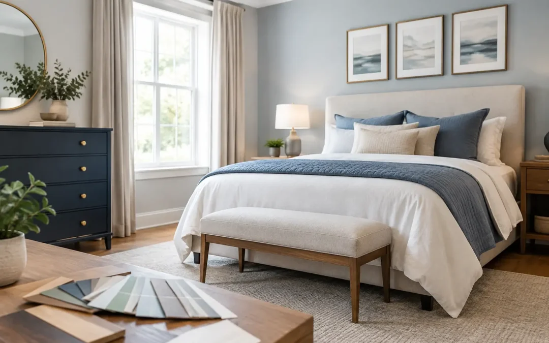
A bedroom can have beautiful individual pieces and still feel unsettled. Usually, the problem is not the wardrobe, bedside tables or paint colour on their own. It is the relationship between them. To coordinate bedroom furniture colours well, start by deciding what should quietly lead the scheme, then make every larger surface support it.
This matters even more with fitted furniture. A floor-to-ceiling wardrobe occupies far more visual space than a freestanding chest of drawers, so its colour and finish set the tone for the whole room. Get that decision right and the room feels considered, restful and easier to keep organised. Get it wrong and even generous storage can feel heavy or out of place.
Start with the room, not a furniture sample
The most reliable colour schemes respond to the fixed elements already in the bedroom. Look closely at the flooring, window frames, doors, radiator covers, curtains and any existing upholstered bed. These surfaces already carry colour, warmth and texture, whether they were chosen deliberately or not.
A pale oak floor, for example, has a different effect beside a warm cream wardrobe than it does beside a cool grey one. Neither choice is automatically wrong, but the undertones need to sit comfortably together. Grey can lean blue, green, purple or brown. White can be crisp and cool, soft and chalky, or slightly yellow. Wood finishes can be honeyed, smoky, red-toned or neutral.
Take samples into the actual bedroom and view them against these elements. A finish that looks balanced in a showroom or on a phone screen can shift dramatically in your home. This is especially true in Kent properties with varied light levels, from bright newer builds to period homes with smaller windows.
Choose one colour direction before adding contrast
Most successful bedrooms have a clear temperature: warm, cool or deliberately neutral. You do not need every item to be identical, but they should look as if they belong to the same family.
For a warm and calm look, consider soft white or mushroom fitted wardrobes with natural oak, linen upholstery and muted terracotta, olive or biscuit accents. This approach works particularly well where the room has warm flooring or lots of natural texture.
For a cleaner, more contemporary feel, use cooler whites, soft greys, stone, pale taupe or dusty blue. Pair these with light neutral carpet, brushed nickel details and fabrics with a subtle blue or grey base. The key is restraint. Mixing a cool white wardrobe with cream walls and orange-toned wood can make each finish appear more pronounced rather than more coordinated.
A neutral scheme is often the safest choice for a long-term fitted bedroom investment, but neutral does not have to mean plain. Warm putty, pale greige, muted sage and soft clay all provide more character than brilliant white while remaining easy to live with.
How to coordinate bedroom furniture colours by visual weight
Colour coordination is also about how heavy each piece looks. Dark furniture appears more substantial, while pale furniture tends to recede. In a small bedroom, this can make the difference between a room that feels generous and one that feels crowded.
If you want darker fitted wardrobes, balance them with lighter walls, flooring and bedding. A deep navy, charcoal or forest green wardrobe can look exceptional, particularly in a larger room with good daylight, but it needs breathing space around it. Matching dark bedside units can create a smart, enveloping effect. Adding a dark bed, dark carpet and dark curtains as well may make the room feel closed in.
Conversely, pale wardrobes can be paired with a darker bed frame or walnut bedside furniture to give the room definition. This is often a practical route when you want fitted storage to blend into the architecture rather than dominate it. The wardrobe is kept light and calm, while one or two freestanding pieces provide contrast.
Think about the proportion of each colour, not just whether you like it. A small black lamp base and a full run of black wardrobes do not have the same impact.
Match finishes, not just paint colours
A room with three matching paint colours can still look disjointed if its finishes clash. The sheen on wardrobe doors, the grain of timber, the style of handles and the metal finish on lighting all affect the final result.
Matt painted doors are forgiving and work well in bedrooms because they feel soft rather than reflective. They also suit classic shaker detailing, modern flat fronts and more decorative panelled designs. A slight satin finish can be useful where easy cleaning is the priority, although it will catch more light.
Woodgrain furniture needs the same careful consideration as painted furniture. If your existing bedside cabinets are oak, do not assume any wood-effect wardrobe will coordinate. Compare the depth of colour, grain pattern and undertone. Sometimes a painted wardrobe in a colour drawn from the timber is more successful than attempting an almost-match.
Hardware is the finishing point that brings separate pieces together. Brushed brass adds warmth to greens, blues, creams and darker timbers. Brushed nickel and chrome suit cooler palettes. Matt black gives definition, but use it with intention, repeating it in a lamp, curtain pole or mirror frame so it does not look isolated.
Use fitted furniture to create a deliberate backdrop
Fitted wardrobes give you a useful design advantage: they can be made to blend with the room or become the feature. Both approaches work, but the choice should be made early.
For a quiet, spacious result, paint wardrobes close to the wall colour. The doors still add structure and storage, but they do not chop up the room visually. This is a strong option for awkward alcoves, sloping ceilings and compact bedrooms, where every visual interruption makes the space feel smaller.
For more impact, choose a wardrobe colour that contrasts gently with the walls. A muted green wardrobe against warm off-white walls, or a soft blue wardrobe against pale stone, can give the room personality without relying on busy accessories. Keep the surrounding furniture simpler so the fitted design remains the focal point.
At WOW Interior Design, wardrobes can be painted in any colour, allowing the cabinetry to work precisely with your chosen wall paint, fabric samples and existing furniture rather than forcing you into a limited standard range.
Avoid the common matching mistakes
The aim is coordination, not a bedroom showroom where every surface is the same shade. Matching the bed, wardrobes, chest of drawers, bedside tables and flooring exactly can make a room look flat. A better result usually comes from repeating colours at different depths and adding variation through texture.
Be careful with near-matches too. A cream wardrobe beside a slightly pink cream wall can look accidental if the undertones conflict. The same applies to whites. If two whites are close but not the same, the difference becomes more obvious when they meet at a corner or skirting line.
Busy patterns can also make colour decisions harder. If you love a patterned headboard, wallpaper or statement curtains, take one quiet shade from that pattern for the fitted furniture. Let the wardrobe act as a stabilising backdrop rather than introducing another competing colour.
Build the scheme in the right order
When planning a bedroom refurbishment, make the largest and least flexible decisions first. Choose fitted furniture colour and door style alongside wall colour, then select the bed and floor finishes. Smaller pieces such as lamps, cushions, artwork and throws can follow.
It helps to create a simple sample board with your wall paint, wardrobe finish, flooring, curtain fabric and a metal sample. View it in morning light and evening artificial light. Bedrooms are often used most at night, so a colour that feels perfect in daylight should also feel comfortable under bedside lighting.
If the room faces north, warm off-whites, soft taupes and earthy muted colours can prevent it feeling chilly. South-facing rooms can handle cooler greys and blues more easily, although strong sunlight can make very pale colours appear brighter than expected. East- and west-facing rooms change character throughout the day, so samples are particularly valuable.
A well-coordinated bedroom should not rely on guesswork or endless compromise. Choose a palette that works with the room you have, give larger fitted pieces a clear purpose, and let texture and smaller accents bring the personality. The result is a bedroom that looks settled from the moment you walk in and works just as hard when it is time to put everything away.